
EY × Mahindra Finance (MMFSL)
Credit lending app that cut loan processing from 3 days to 30 min
Cut loan processing from 3 days to 30 minutes by digitizing workflows and unifying 6 fragmented tools into a transparent Android app.
- Role
- Lead UX designer
- Type
- 0→1, Enterprise Fintech, Android app
- Timeline
- 7 months · 2023
- Team
- UX Designer (me), UI and Design System (me+1), Design Manager, PM, Engineering, BRD
- My contribution
- I led UX design for the end-to-end lending workflow, from field research and journey mapping through interaction and UI design, prototyping, usability testing and developer handoff. I partnered with Product, Engineering, Business, and client stakeholders throughout the project.
3 days → 30 mins
Application processing time
+54%
Applications processed per agent/day
−86%
Data entry errors
6 → 1
Systems consolidated
Measured across 40 applications from 10 agents over 6 in pilot. Baseline of 3 days from as-is mapping and client data.
Overview
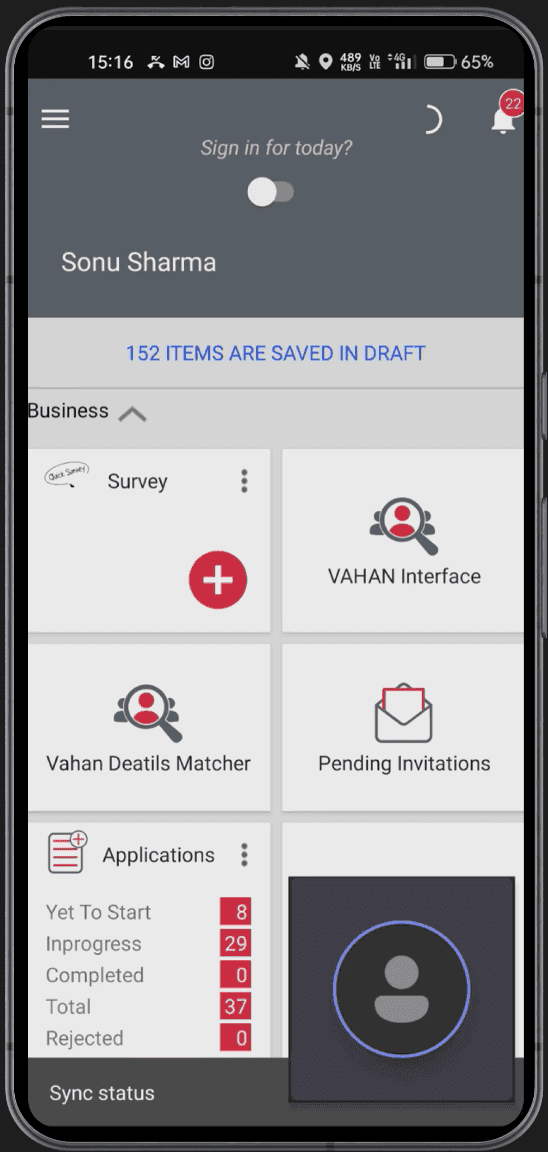
Loan applications took up to 3 days across 6 disconnected systems
Field agents processed loan applications across multiple tools, manual handoffs, and approval steps. Even small inefficiencies compounded across thousands of applications, slowing decisions and increasing operational overhead.
Business goal: Digitize the lending process to improve turnaround time, agent productivity, and data accuracy.
Process
I shadowed field agents and mapped disjointed workflows to understand how they actually worked in the field
20
Contextual inquiries
03
As-is journey mapping
20
User interviews
04
Competitive analysis
Current experience
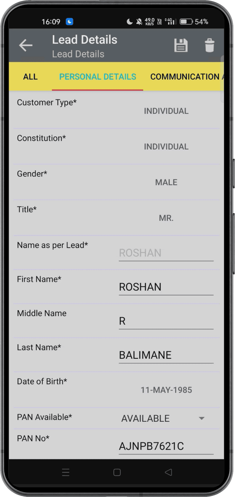
- 1Day 1Lead captureTool AManual entry
- 2Day 1Document collectionTool BRe-entry
- 3Day 1–2Credit checkTool CPhone calls
- 4Day 1–2Data entryTool DPhone calls
- 5Day 2–3Offer generationTool D3-day wait
- 6Day 3SanctionTool ENo visibility
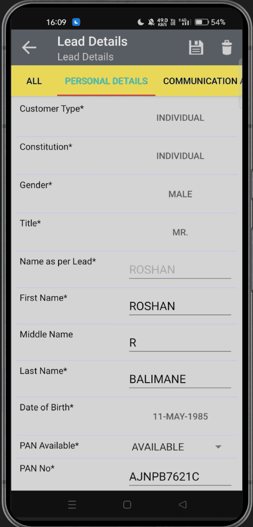
- 7Day 3+DisbursementTool FManual follow-up
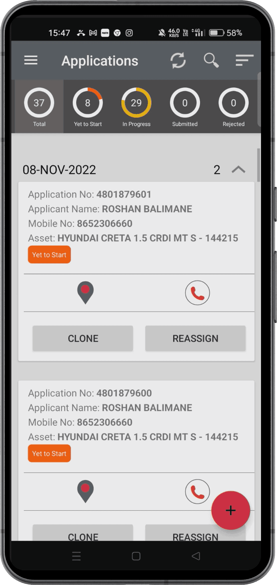
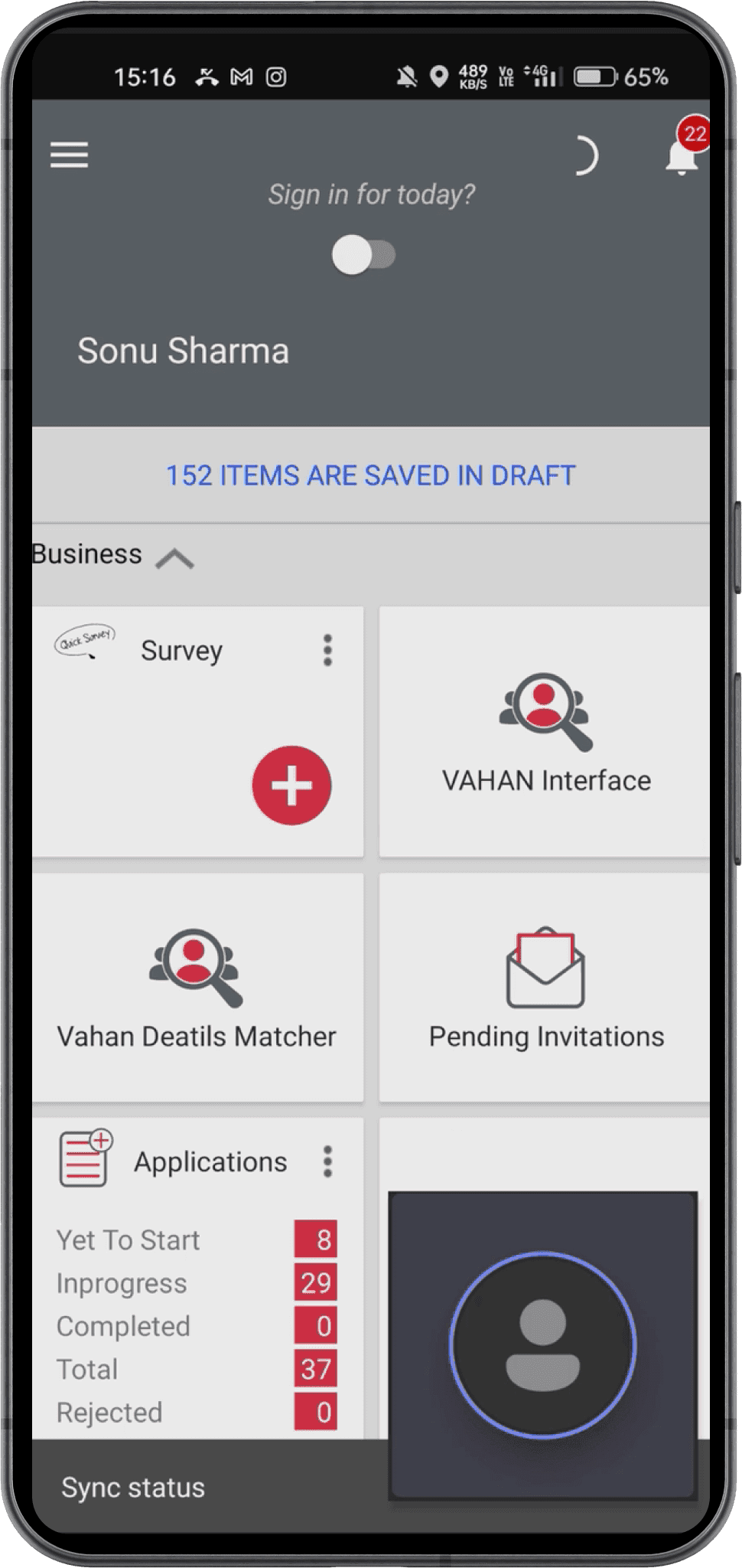
6 disconnected tools! Pain points at every handoff
Findings
The system forced agents to adapt to the tool, not the other way around. Their tools were slowing them down, delaying loans.
Field agents were stuck juggling too many tools, calling managers for updates, and waiting days for simple loan offers.
Fragmented tool ecosystem
Agents switched between multiple systems, adding 45–60 minutes to each application.
No application visibility
Agents relied on calls, WhatsApp, notebooks, and memory to track application status.
3-day offer turnaround
Basic filters delayed decisions that could have been resolved earlier.
Manual entry caused the biggest rework loop
Repeated typing introduced errors, rechecks, and delayed approvals.
Balancing simplicity with complex constraints
- Cross-team backend coordination
- Must integrate with legacy systems
- User diversity
- Minimize training time for agents
- Maintain compliance requirements
Before designing, I aligned with Product and client stakeholders on four measures of success.
Targets were informed by current performance, competitive analysis, and industry best practices, then aligned with Product and business stakeholders.
| Goal | Metric | Baseline | Target |
|---|---|---|---|
| First offer turnaround | Offer generation time | 3 days | Same day |
| Agent efficiency | Applications processed per agent/day | 5–6 applications per day | Improve by 30%+ |
| Data quality | Data entry error rate | 1 day rework per application | Reduce by 50% |
| Field usability | Task completion rate | 28% | Improve by 30%+ |
Design direction
How might we reduce the complexity of loan processing while giving agents the information and guidance they need in the field?
These principles directly addressed the four recurring breakdowns we saw in field research: tool switching, repeated data entry, unclear status, and delayed decisions.
Consolidate touchpoints
Eliminate redundant input
Design for status visibility
Reduce manual entry points
Key trade-off
We optimized the workflow for the most common application path rather than automating every exception. Manual overrides were retained for edge cases where agents still needed flexibility.
The redesigned journey
From six disconnected systems to one five-stage workflow
- Step 1Consent2 min
- Step 2KYC5 min
- Step 3Sanction15 min
- Step 4Post sanction5 min
- Step 5DO issue3 min
Total: ~30 minMobile-firstReal-time offers
Each stage mapped to a familiar step in the existing lending process, reducing the amount of new terminology agents had to learn.
Iterations
I tested multiple iterations with agents to find where the design actually broke down
1. Breaking a complex application into manageable steps
V1
14 of 20 agents in usability testing didn't interact with the circular progress indicator — they didn't understand it as navigation.
Final
Agents immediately understood where they were. Stage labels matched their existing vocabulary from the paper process.
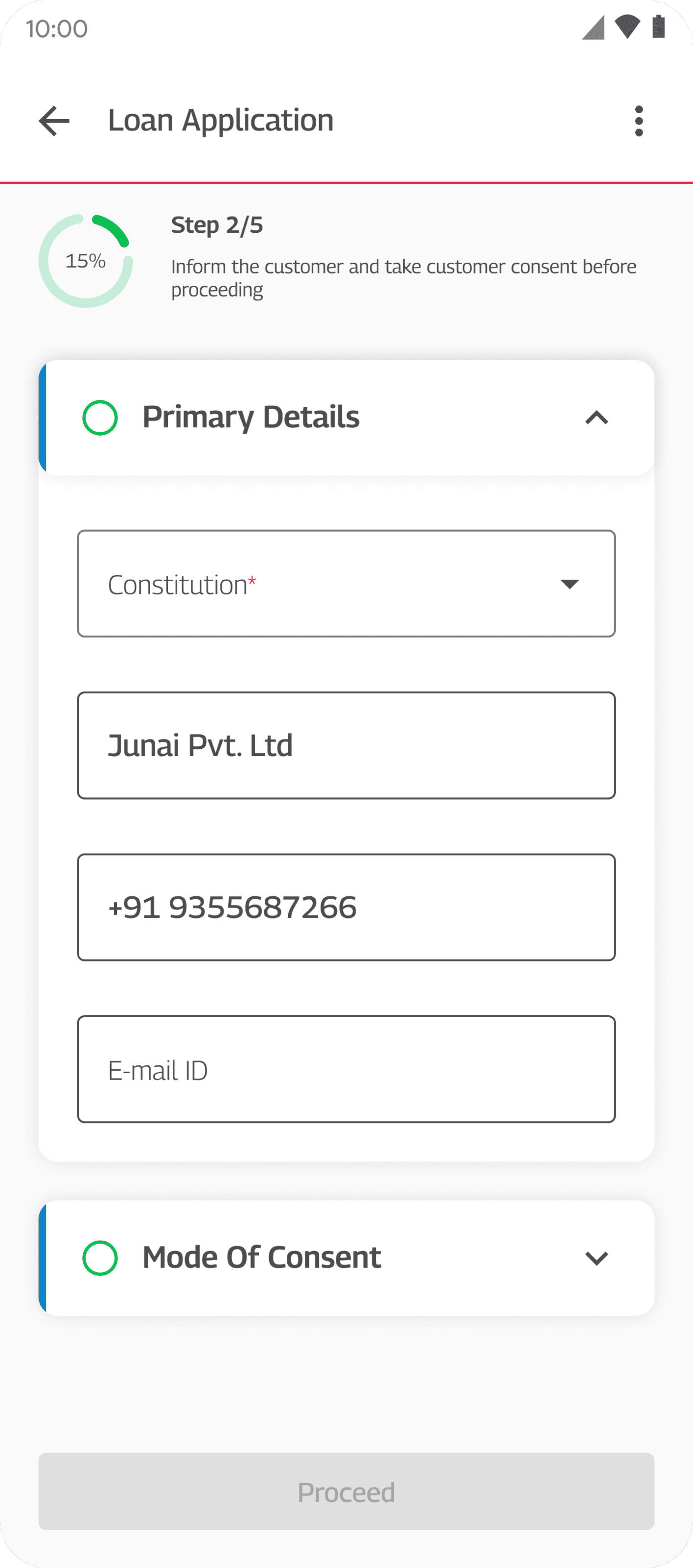
I grouped related fields into progressive sections and surfaced validation at the section level, helping agents focus on one part of the application at a time.
2. Dashboard
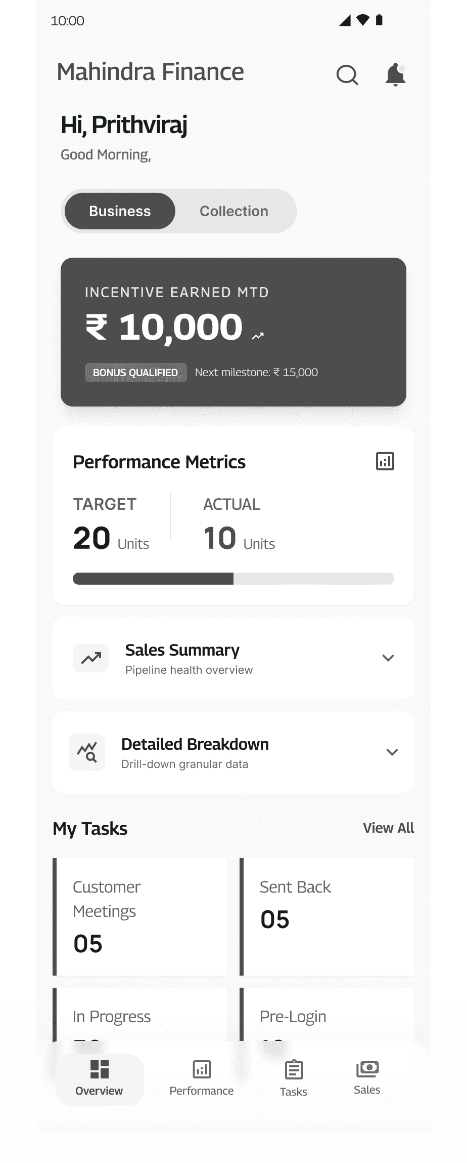
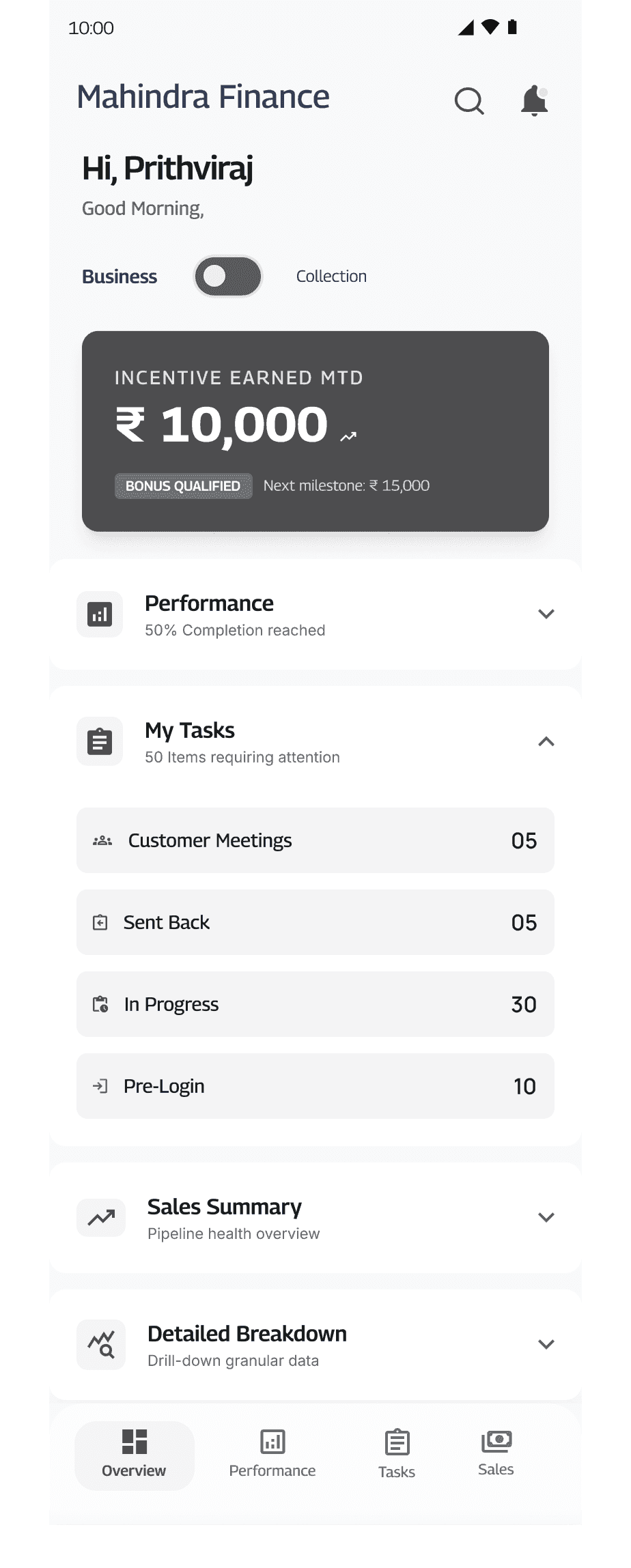
V1
Didn't distinguish complete / pending / blocked. Agents couldn't prioritize without opening each card.
V2
Status required opening individual applications.
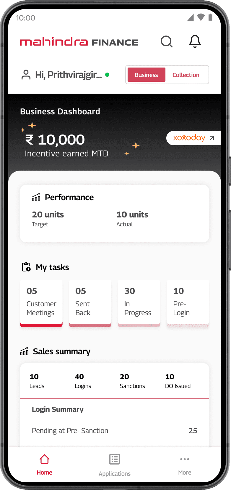
Final
Agents saw priority work immediately. Status was scannable in 2 seconds.
Final solution
To design a unified mobile workflow, so agents could trust it enough to stop working around it.
A unified experience, allowing the entire application process in one place
Tasks, documents, approvals, and application status — all in one place. With a timestamped activity history, agents see where every application stands without calling anyone.
Progressive, 5-stage form designed for mobile to reduce cognitive load
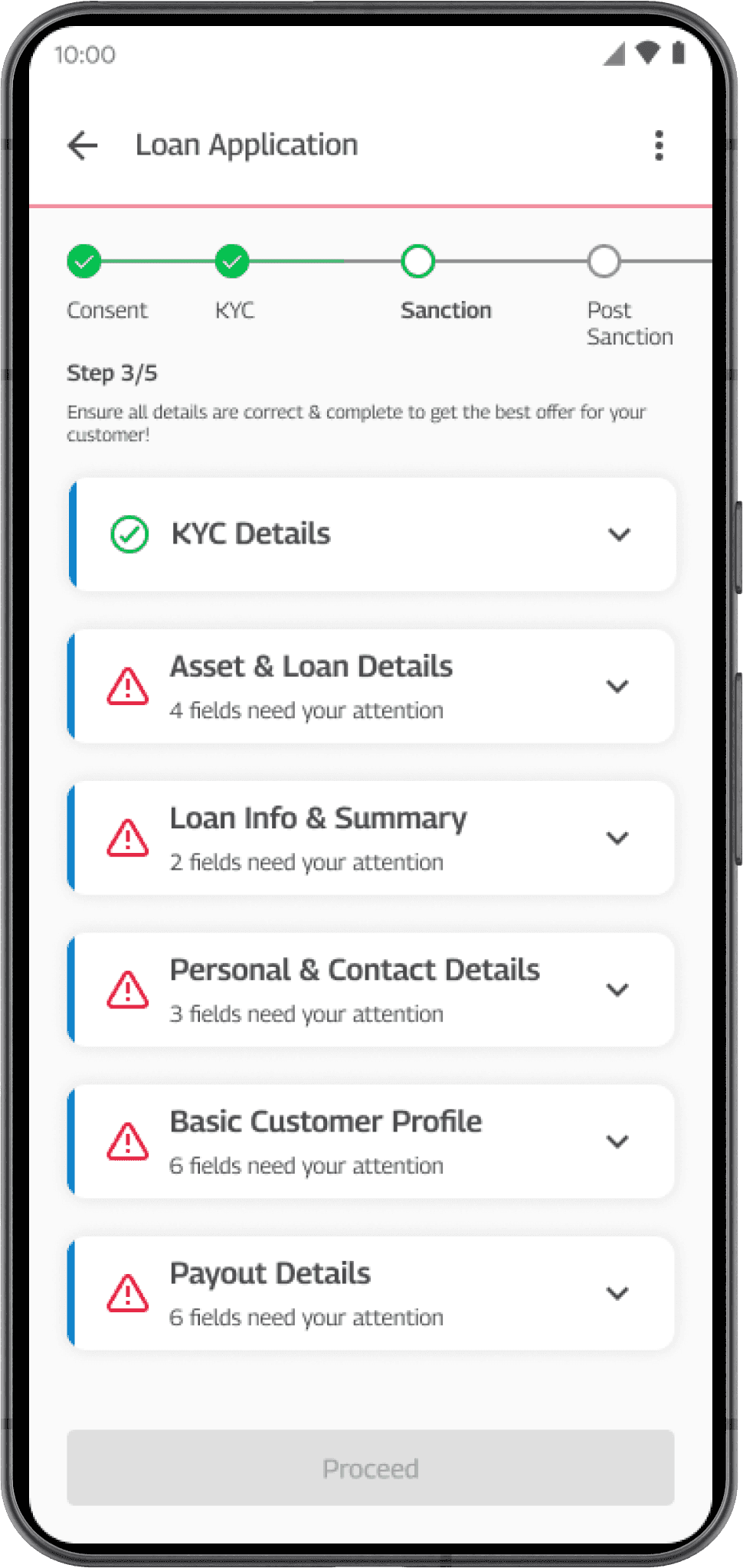
Five clear stages. Vertical progressive disclosure. A visible tracker that tells agents exactly where they are and what's left.
- ✓Consent
- ✓KYC
- Sanction
- Post sanction
- DO issuance
Step 3/5
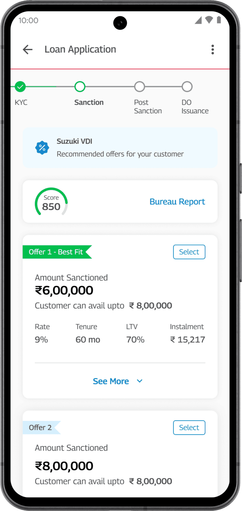
Ensure all details are correct & complete to get the best offer for your customer.
V1 — circular progress indicator
14 of 20 agents in usability testing didn't interact with the circular progress indicator — they didn't understand it as navigation.
Final
Stage labels matched their existing vocabulary from the paper process, so they understood where they were.
Bring decisions into the active application
Accelerate offers — eligible profiles can receive loan offers during the application session, within 30 minutes.
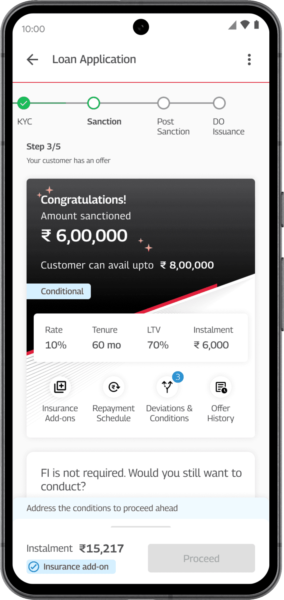
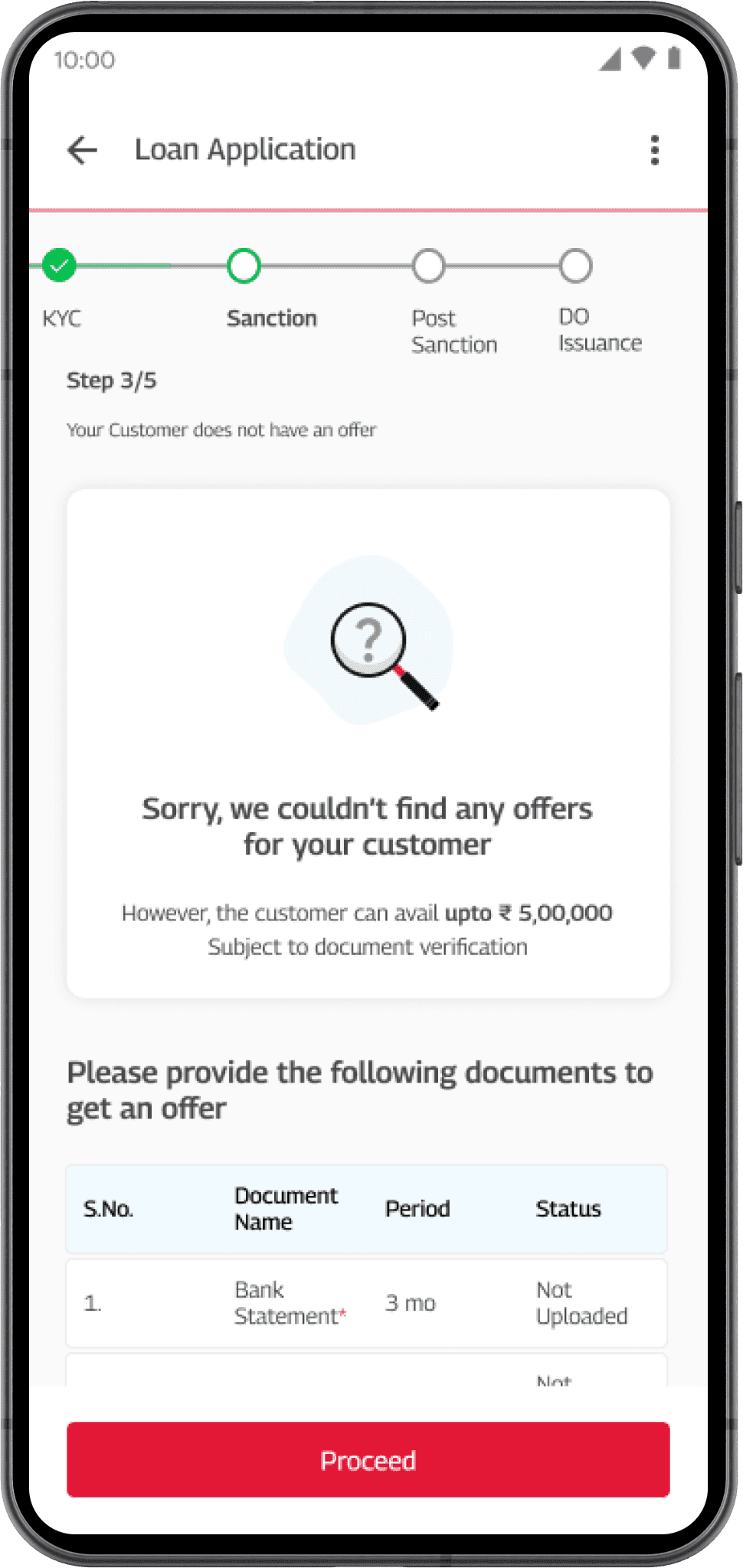
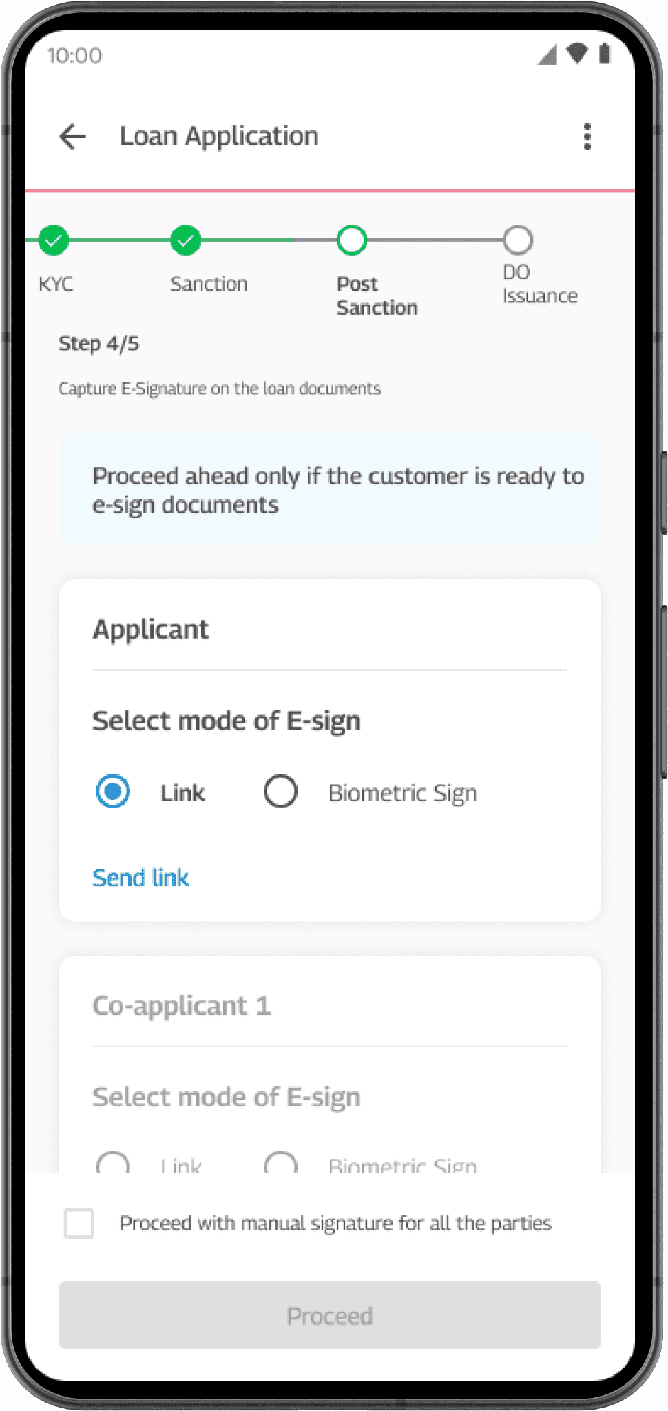
Digital KYC and e-signature for an end-to-end paperless process
KYC, loan agreement signing, and mandate setup moved into the digital flow, removing paper dependencies from the workflow. Agents type less, reducing errors from manual data entry.
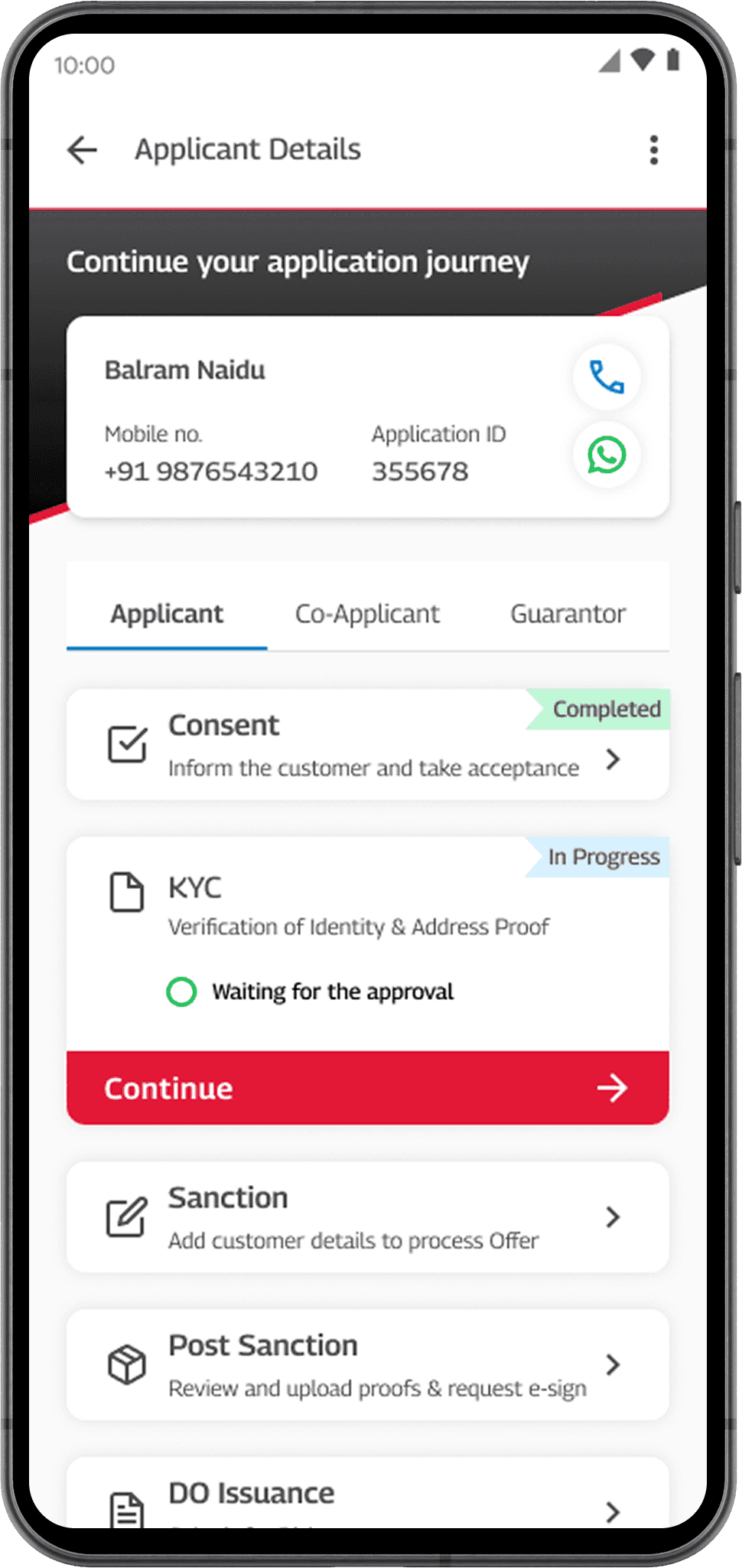
Agents always know what is happening and what to do next, because next steps are visible
Agents see the status of every application in one place. Every application shows its current stage, what's pending, and the single next action the agent should take — in real time, to reduce cognitive load.
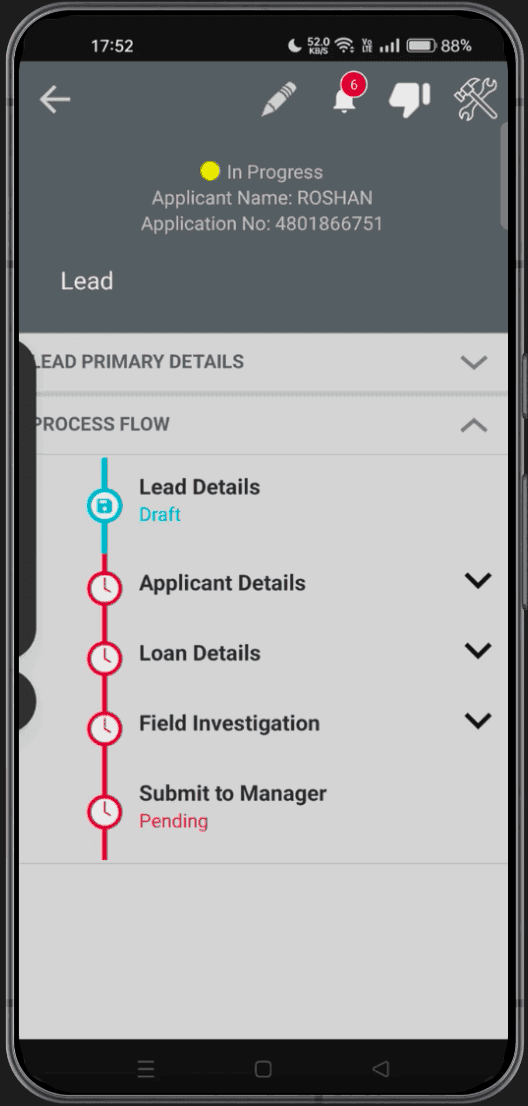
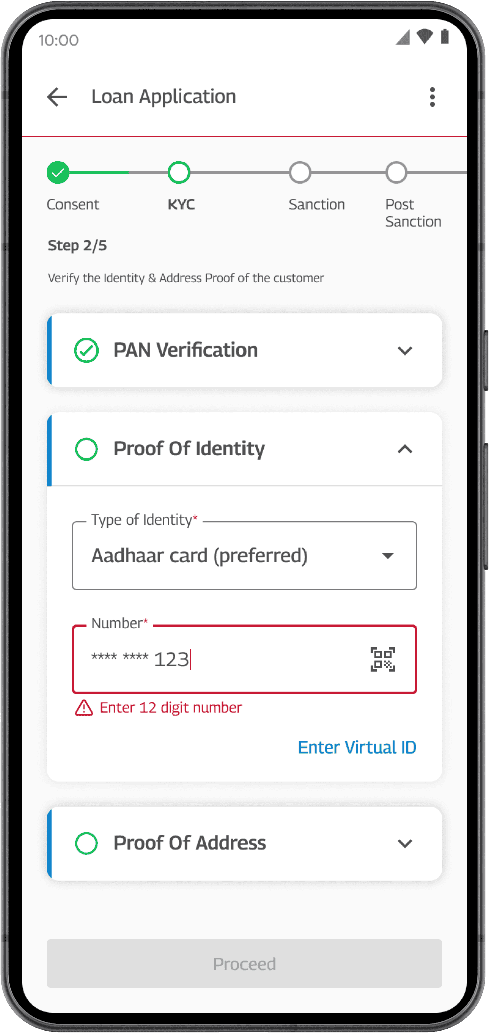
Design for field conditions
Validation, inline guidance, and clear system feedback helped agents resolve issues without leaving the workflow or relying on memory.
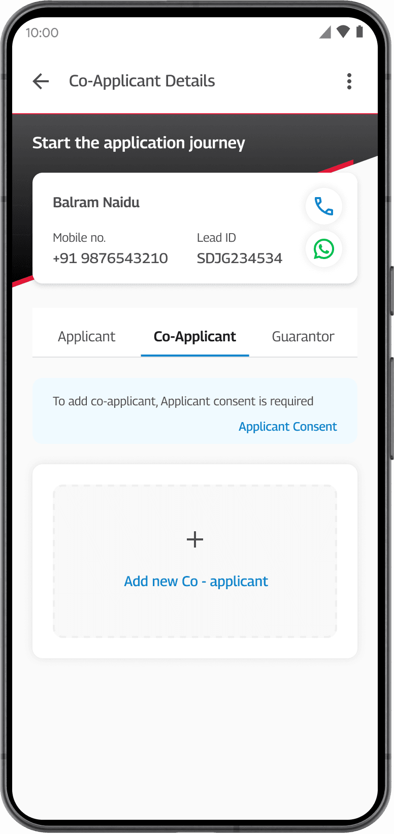
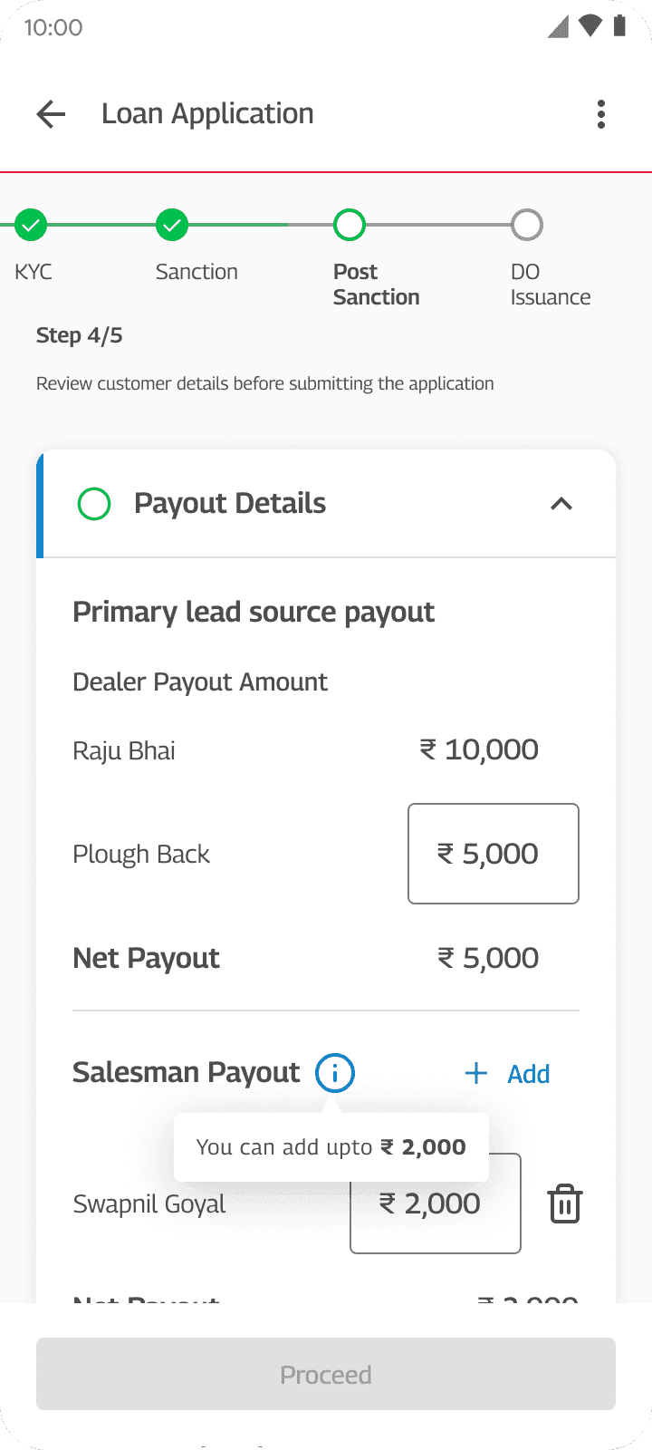
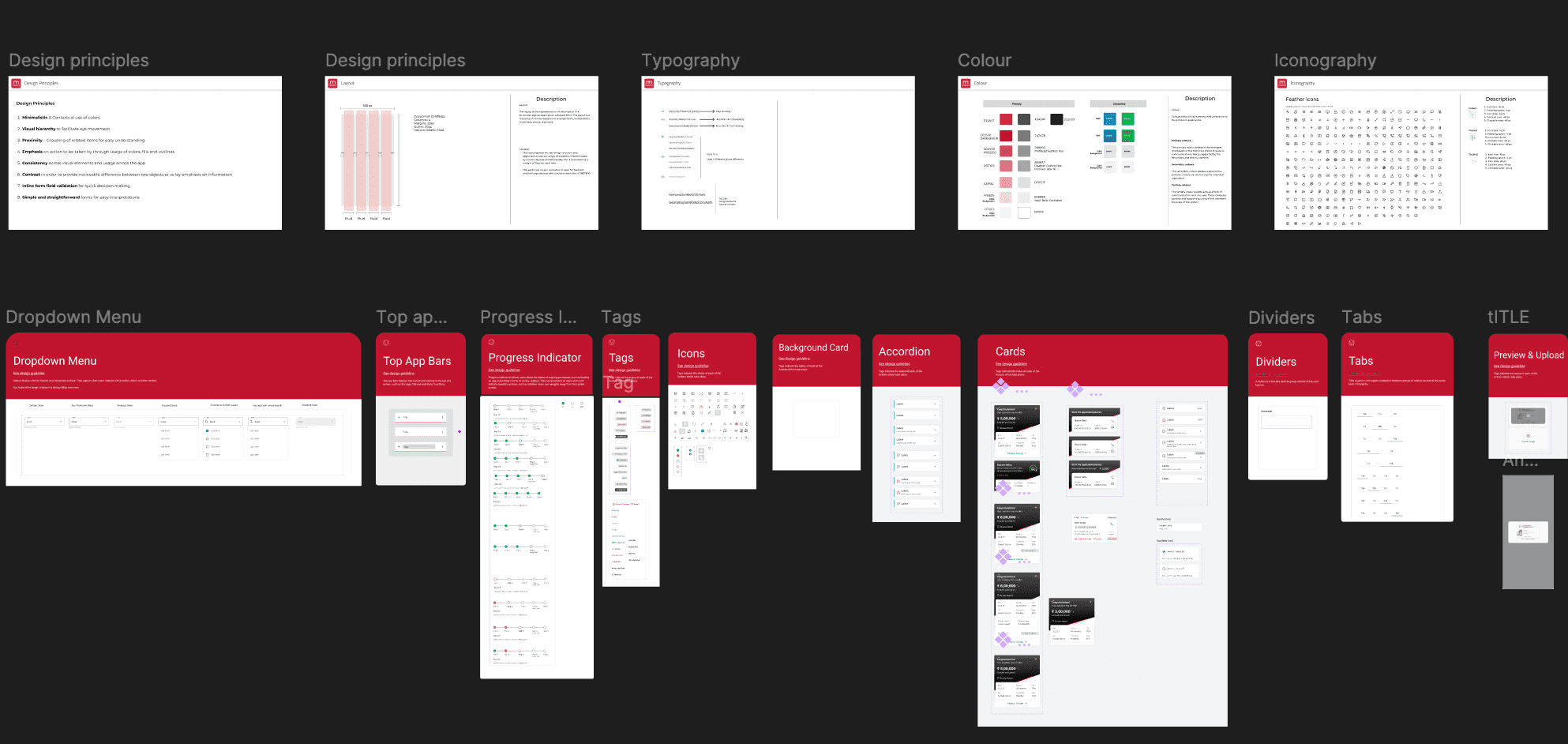
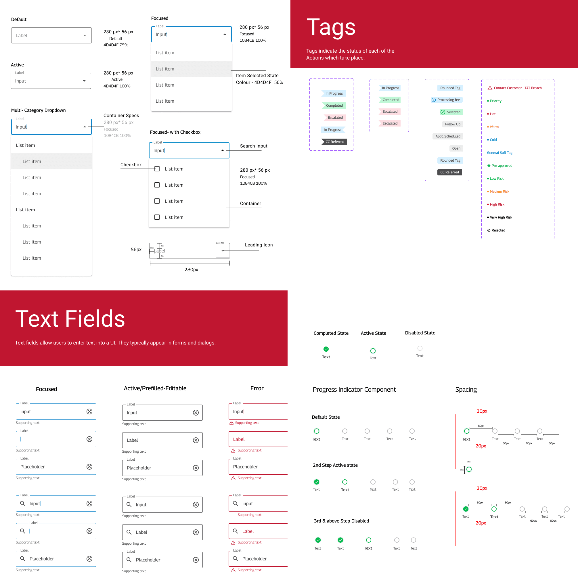
Designing in systems
Reusable components that kept the workflow consistent as it expanded
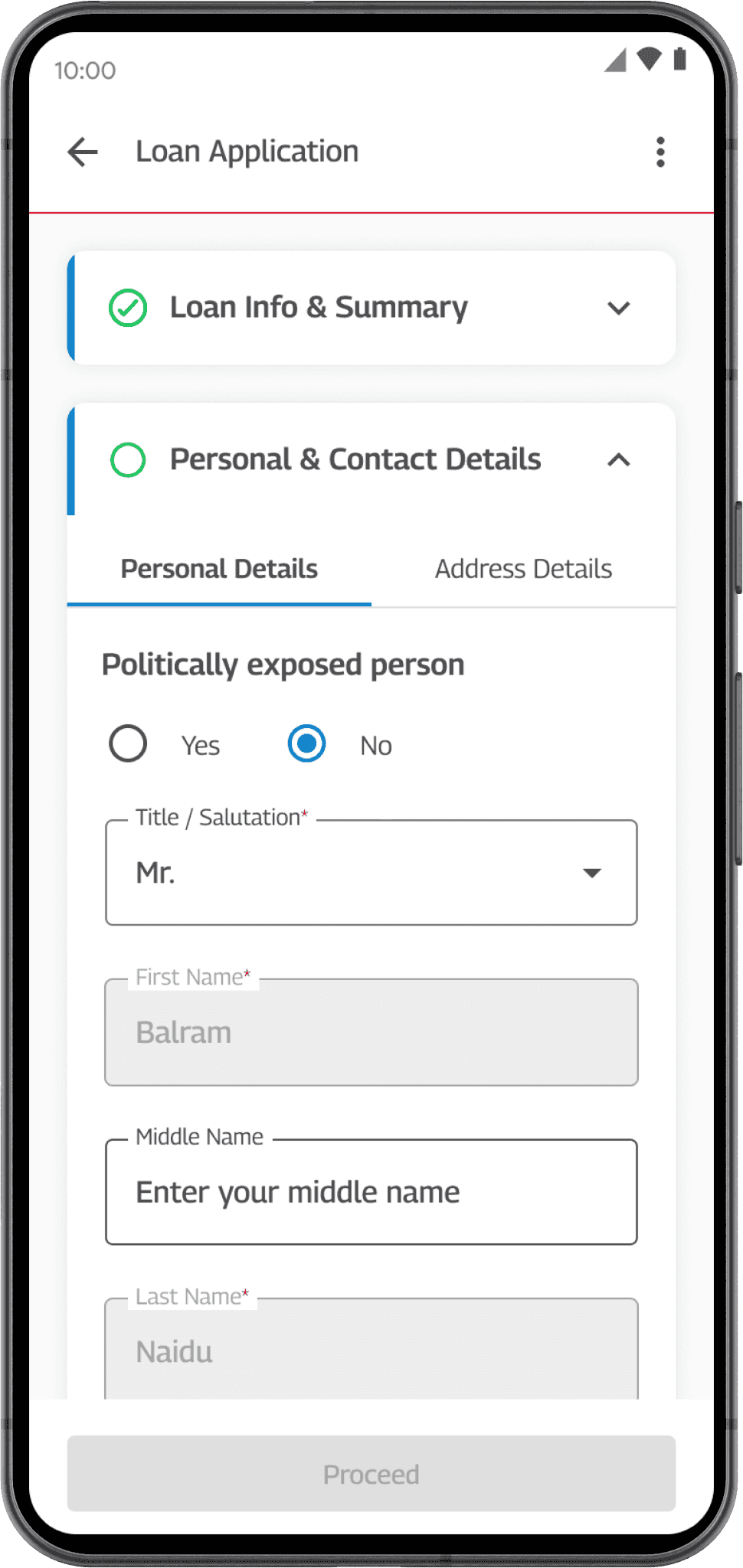
I co-created (along with one designer) reusable components and states for inputs, validation, progress, status, and system feedback so patterns stayed consistent as the workflow expanded.
After
“I can see exactly where every application stands from the app. I don't need to call my manager anymore.”
Key learnings
What I'd carry forward
Optimize the common path without designing away necessary complexity
Trying to automate every lending scenario would have made the primary workflow harder to use. Designing for the most common path while preserving manual overrides gave agents speed without removing the flexibility needed for exceptions.
Simplifying the interface starts with simplifying the system
The biggest gains didn't come from making individual screens easier to use. They came from removing handoffs, redundant entry, and tool switching across the end-to-end lending workflow.
Define success before committing to a solution
Aligning on turnaround time, agent efficiency, data quality, and task completion gave the team a shared way to evaluate design decisions beyond preference and helped keep the work connected to operational outcomes.
I managed Anjali at EY on the Mahindra Finance project, where she was Lead UX Designer on a 0-to-1 enterprise fintech app. She led research from the ground up and translated that into a unified mobile experience.
Anjali has a rare ability to turn messy, high-stakes operational problems into clear, usable interfaces, and to bring stakeholders along with data rather than opinion. She also built the design system that kept the experience consistent as we scaled across flows, and she was someone I could put in front of the client directly. She'd be a strong addition to any product design team.
 Vriti Wadhera · Design Manager at EY