
EY × Tata AIA
Design system that unified 3 enterprise products
Built a responsive, WCAG AA design system and applied it across 30+ high-use agent workflows, reducing navigation time by 48% and creating a shared interaction language across products.
- Role
- UX/UI Designer
- Type
- Enterprise, Insurance, Web + Mobile App
- Timeline
- 3 months · 2023
- Team
- 2 UX/UI Designers (me + 1), Design Manager, PM, Engineering
- My contribution
- I co-designed the system with another designer, with my focus spanning research synthesis, interaction patterns, responsive behavior, accessibility standards, component documentation, and application across key agent workflows.
−48%
Reduction in agent navigation time for key workflows
+96%
Cross-platform UI consistency achieved, measured through a design audit after the system rolled out
3
Products using the system
Overview
Multiple apps. No shared language. Too much relearning.
Tata AIA's agent network relied on multiple applications for onboarding, renewals, commissions, and relationship management. These products had been built independently, creating inconsistent patterns and forcing agents to relearn common interactions across workflows.
Process
Audited existing products to identify where inconsistency created the most friction.
I compared recurring UI patterns, responsive behavior, accessibility, and high-frequency agent workflows to identify where standardization would have the greatest impact.
3
Products audited
20+
Screens reviewed
50
User surveys
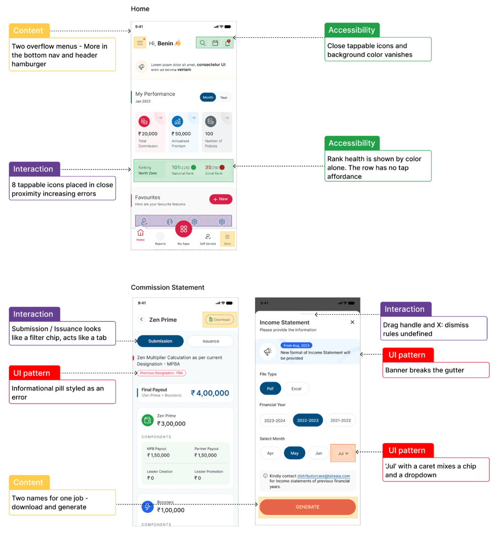
Audit findings
Similar workflows behaved differently across products
The audit surfaced recurring inconsistencies in interaction patterns, responsive behavior, and accessibility.
Insights
Research surfaced the same three problems again and again
Teams recreated the same patterns differently
Common controls and workflows behaved differently across products, increasing maintenance and forcing agents to relearn familiar interactions.
Responsive behavior wasn't systematic
Components were often designed for individual screens rather than as reusable patterns across desktop and mobile.
Accessibility varied by product
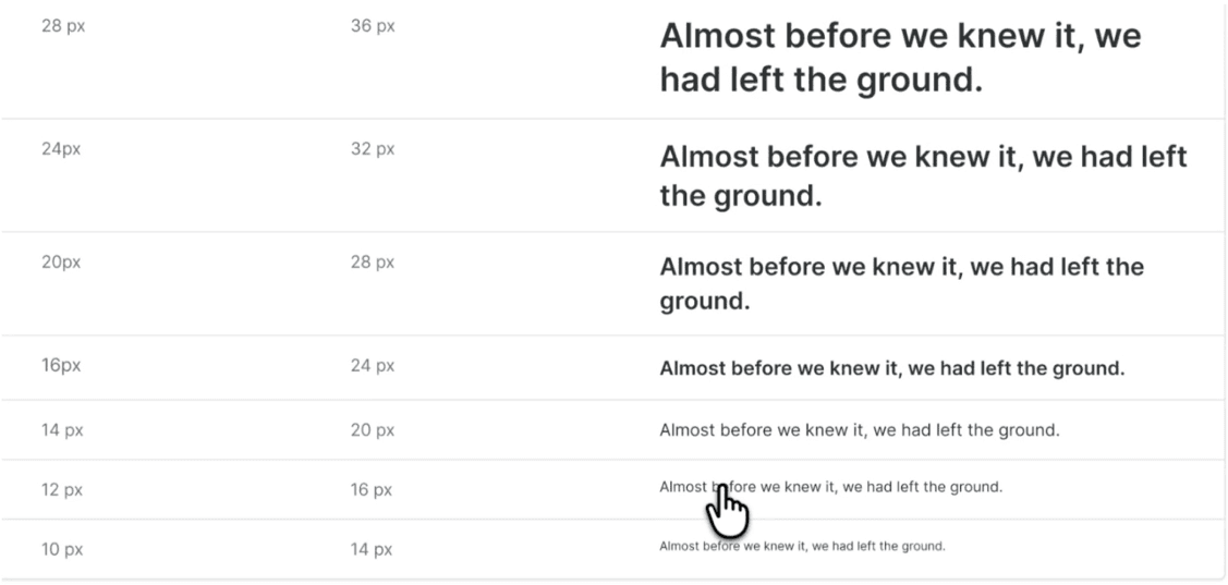
Contrast, field states, responsive behavior, and interaction feedback lacked consistent standards.
Challenge
How might we create one coherent product experience without slowing delivery?
The pressure
- Stakeholders wanted screens quickly.
- Teams needed reusable patterns.
- Agents needed less ambiguity.
- Engineering needed clearer implementation rules.
The strategic bet
Build the foundation first, then redesign the highest-value surfaces on top of it.
Strategy
Build the foundation first. Redesign the portal second.
I focused on turning repeated design choices into reusable product infrastructure: color, type, spacing, components, states, responsive rules, accessibility criteria, and implementation guidance.
Design reusable patterns
Mobile-first, then desktop
WCAG AA by default
Prioritize high-value workflows
Exploration & system decisions
Designing patterns that could scale across products and breakpoints
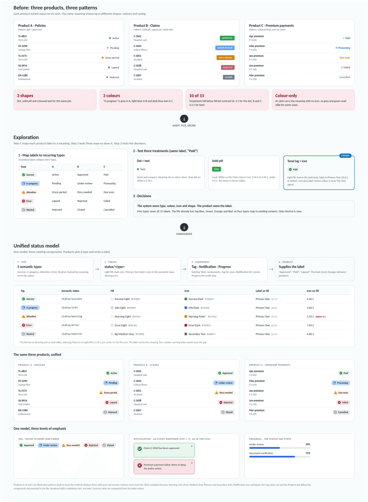
One status model across three products
I mapped existing status patterns across products, separated semantic meaning from visual treatment, and consolidated them into a shared model that could scale across workflows.
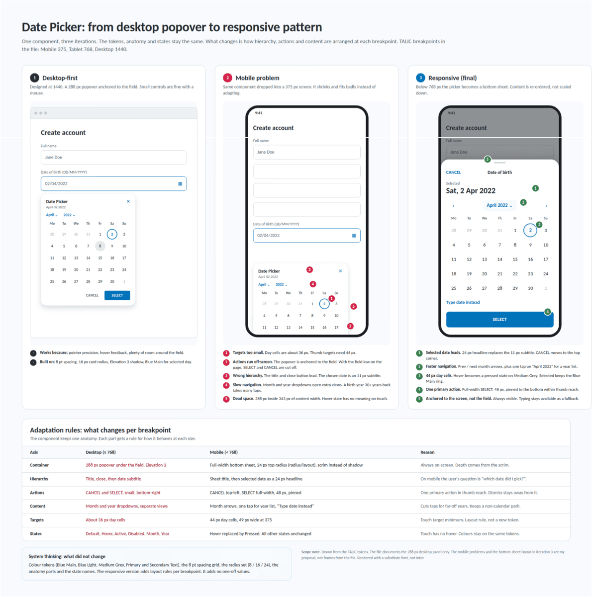
Adapting complex components across breakpoints
The date picker started as a desktop popover. On a 375px screen its targets were too small and its actions ran off-screen, so it became a bottom sheet with larger targets and one primary action.
Design system
A shared language for design and engineering.
Each component defined usage, responsive behavior, interaction states, accessibility requirements, and implementation guidance so design and engineering worked from the same source of truth.
Foundations
Tokens, type, spacing, color, accessibility
Components & patterns
Inputs, cards, tables, badges, modals, navigation. Forms, status, responsive workflows, complex states
Documentation
Figma library, Storybook references, usage rules, contribution process, and handoff notes
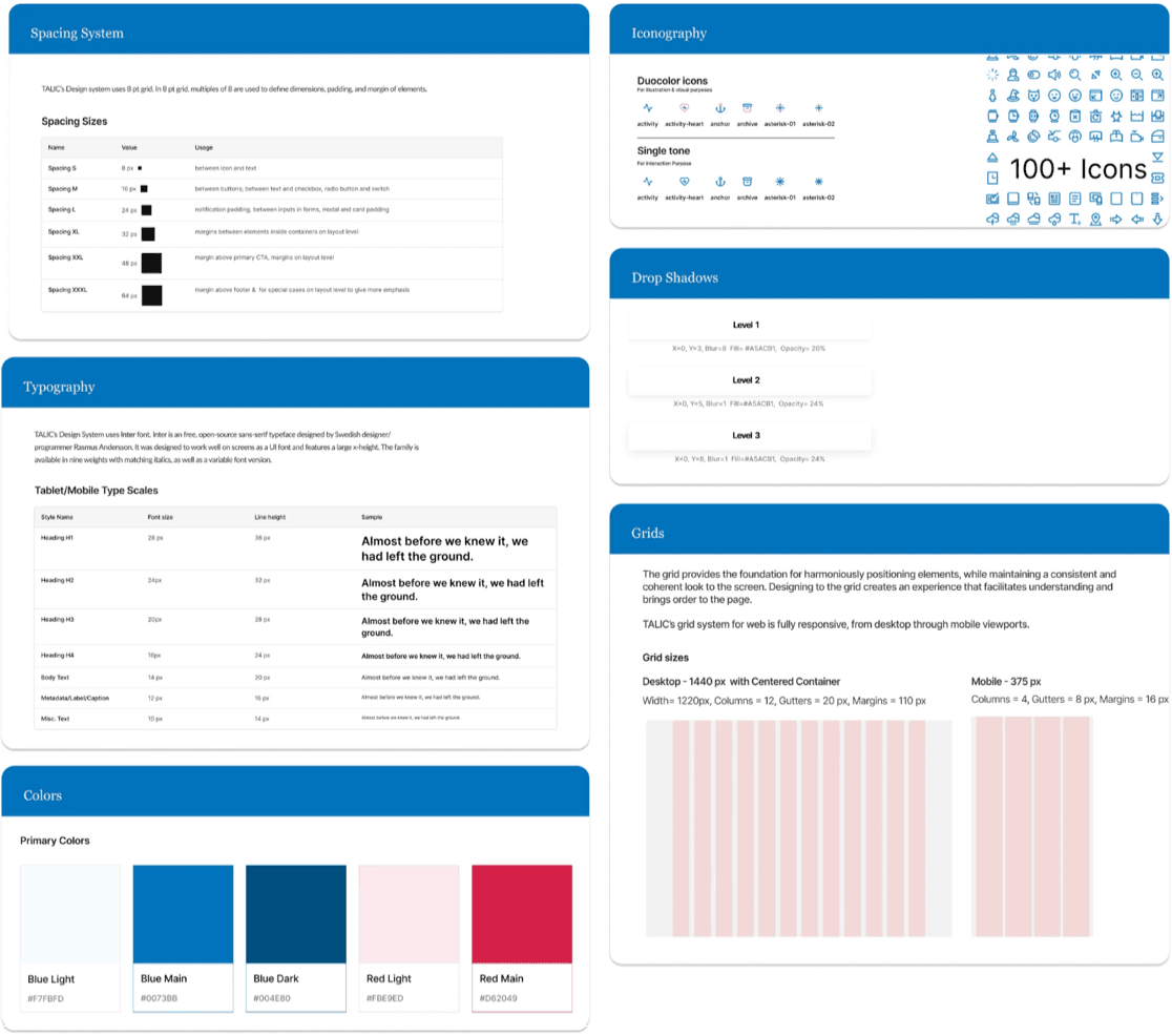
Foundations that scale across products
Tokenizing color, type, spacing, and layout meant global changes could propagate across components instead of being updated screen by screen.
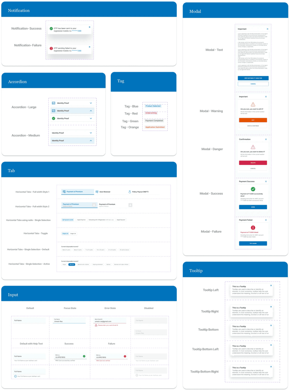
Composable components
Components were designed across responsive breakpoints and documented with interaction states, accessibility requirements, and developer handoff guidance.
Adoption strategy
A design system only creates value when teams use it.
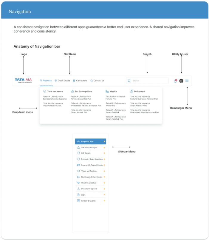
Documentation & training
Created comprehensive documentation in Figma and Storybook. Ran workshops with design and engineering teams to demonstrate component usage, best practices, and the system's underlying logic.
Figma library
Published components with usage guidelines
Storybook
Interactive component documentation for devs
Workshops
Training sessions with design and engineering on component usage, responsive behavior, and contribution guidelines
Governance & maintenance
Established a contribution model for proposing components, requesting changes, and reviewing updates so the system could evolve without fragmenting.
Monthly reviews
System updates and new components
Office hours
Weekly support for teams
Contribution process
Clear guidelines for adding to the system
Application
Then I applied the system to 30+ agent portal screens.
I applied the system to high-frequency agent workflows to validate that the patterns could handle real product complexity across desktop and mobile.
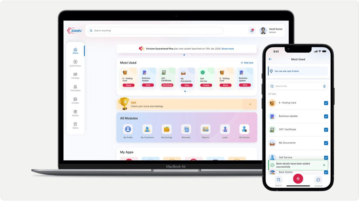
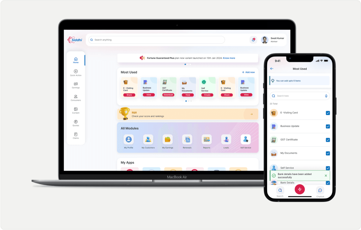
Priority-first home
Surfaced pending work and high-priority actions directly on the dashboard so agents didn't have to navigate across modules to understand what needed attention.
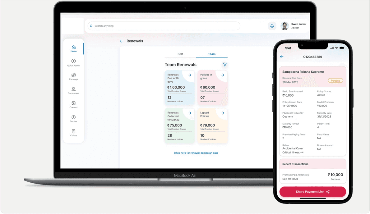
Unified policy status view
Standardized status patterns across workflows so agents could interpret progress consistently without relearning each module.
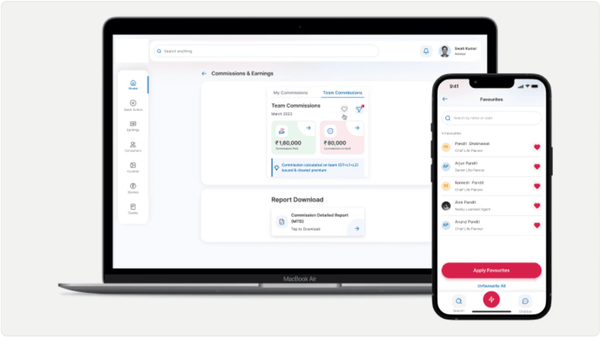
In-app invoice generation
“Hard to find GST” was the third most common survey pain point. I brought invoice generation into the portal with OTP verification, removing a manual workflow and repeated data entry.
Identity + self-service hub
Redesigned as a proper identity hub — showing designation, rank, and performance signals. Agents can manage bank details, contact information, and documents themselves without routing through support.
Key learnings
What this project taught me
Standardization should remove decisions, not flexibility
A useful system defines recurring decisions once while leaving room for product-specific needs. The goal wasn't to make every experience identical — it was to make familiar interactions predictable.
Adoption is a product problem
Components alone don't create consistency. Documentation, governance, contribution paths, and engineering partnership were as important as the library itself.
Validate systems through real workflows
Applying the system to high-frequency agent workflows exposed gaps that isolated components couldn't. Testing the system against real product complexity made the foundation stronger.